...
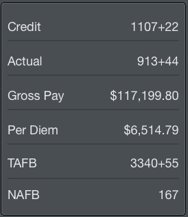
After the graph you will find specific payroll information broken down into various items. On iPhone this chart is below the graph while on iPad it is beside the graph.
Among these items are:
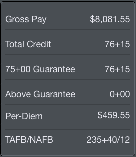
- Gross pay amount in dollars
- Total credit in hours and minutesHours and minutes toward Guarantee and Above Guarantee
- Paycheck deductions (such as healthcare premiums)
- Employee retirement contribution
- Taxes
- Per Diem amount in dollars
- Time Away From Base (TAFB) in hours and minutes Nights Away From Base (NAFB)
- Net Pay
Retirement contributions are further broken down in the Retirement section at the bottom.
At the very top of this chart is a Pay Calculator row. Tapping this row will allow you to adjust the assumptions used to calculate these values. This can allow you to experiment with different scenarios such as if you were to switch to an aircraft with a different pay rate, pick up additional or drop to less credit hours, or change your retirement contribution amounts.
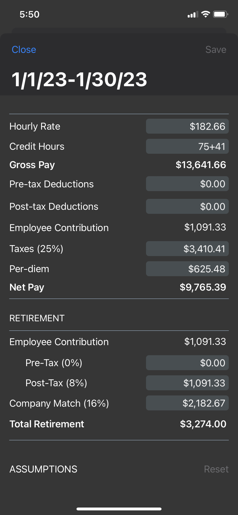
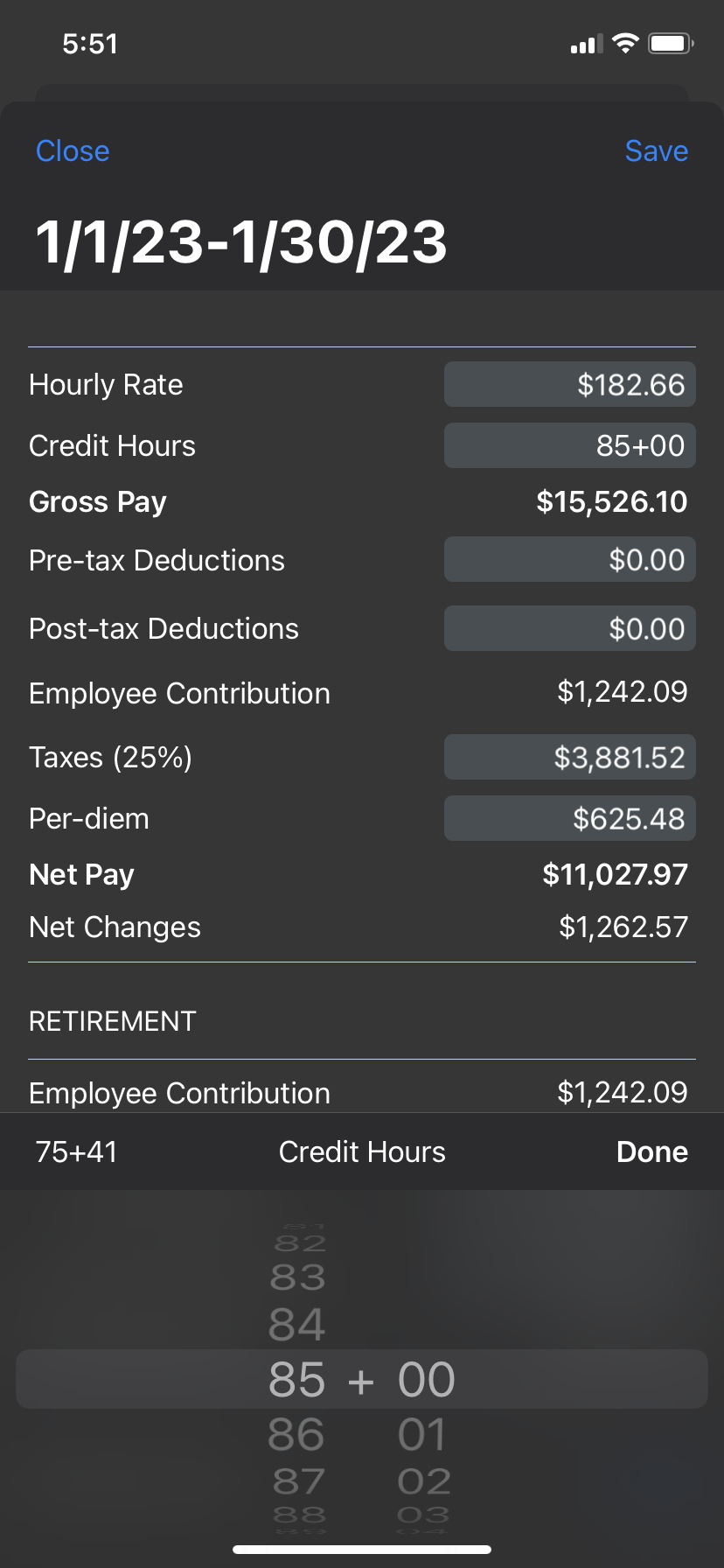
Tapping any light gray colored box will allow you to edit that value. While editing the value, all calculations are updated live for a quick comparison.
If you edit any values, the "Net Changes" row will be added showing changes from what the original values were. Additionally, tapping the original value at the upper left of the value selector area will revert the changes to the original value for that row. In the screenshot above, the original credit hours value was 75+41 which has been changed to 85+00. Tapping "75+41" at the upper left of the selector area will revert the credit hours value to 75+41.
Any values represented by a percentage such as Taxes, and Company Match will allow you to choose a percentage, but are calculated as dollar amounts.
Tapping Save at the upper right after making edits will save those edits for future use on this payroll chart. Some values will revert to the actual values each time such as credit hours and per diem, but if you change the pay rate it will overwrite the pay rate set under Settings/Airline and affect all other calculations going forward.
This same chart format is displayed at the bottom of the page below the Year to Date graph with year to date values.
Anchor daterange daterange
Date Range
| daterange | |
| daterange |
...
This section is always visible regardless of the Pay Details section above being collapsed or expanded. A bar graph displays your monthly credit throughout the year. The year is based on the current date range and is displayed above the graph in blue. The values displayed are determined using actual credit for past months and projected credit for the current month.
After the graph you will find specific yearly payroll information broken down into various items. On iPhone this chart is below the graph while on iPad it is beside the graph.
Among these items are:
...
The Year to Date chart uses the same format as the chart described above.