


Logbook Pro offers the most powerful graphing/charting of any software package. Using a high speed data analysis engine, a visual representation of your data is displayed in approximately one second. Completely interactive, refer to the Tips and Tricks section of this help documentation to learn how the graph can be manipulated in 3D or zooming and scaling effects performed. Graph styles include vertical bar charts, horizontal bar charts, and pie charts. Graphs are completely customizable in formatting from colors, legends, grid lines, and value displays. Logbook Pro offers the continued support for export offering export to JPEG Bitmap graphics (.JPG), Portable Network Graphs (.PNG) and even creates a web page for you, exporting to a .HTM file. Figure 1 below shows an example of a bar chart and the general layout of a graph.
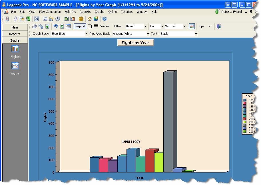
Figure 1. Vertical Bar Chart
The graph toolbar, as well as the right-click popup menu provide a plethora of user-configurable options. When first starting the presentation of graph data, a date filter window, as shown in Figure 2 below, will appear, allowing the complete flexibility in filtering the data per the users desire. A date filter change can occur by clicking the calendar icon on the toolbar allowing the immediate query of a new date range. 3D effects can be modified as well as color formatting, which are remembered for each individual graph displayed, recalled for future calls of the same data.
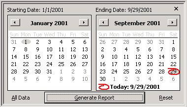
Figure 2. Date Filter
The Date Filter as shown in Figure 2 provides easy filtering of the logbook data. The calendars are the same one used on any standard windows application and therefore have the same key shortcuts and capabilities. To rapidly change the month, click the title of the month itself and a drop down of the 12 months will appear, for rapid selection. To rapidly change the year, click the year value itself above the main calendar and a up/down arrow will appear allowing for easy scrolling of the years. Select a particular date from the calendar and the value at the top of the dialog will reflect the value selected.
Pie charts are also viewable by changing the selection from the main graph toolbar, above the graph area. Figure 3 below shows an example of a pie chart.
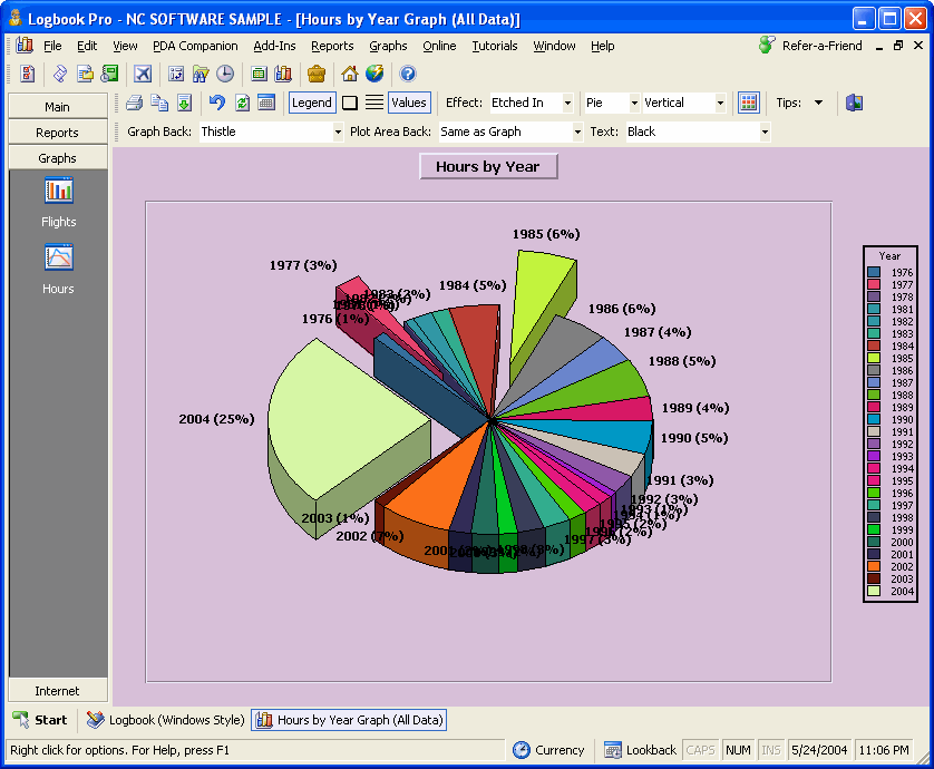
Figure 3. Pie Chart
In the pie chart example above, the values button on the toolbar is depressed fixing the values outside each respective data section. In bar chart view, the values are represented as actual values, in pie chart mode, they are represented in percentage, maintaining flexibility for the users needs. Left-clicking and dragging a particular slice allows it to be removed from the pie center, making the data highlighted for analysis purposes. To learn more about the interactive capabilities, such as 3D rotate, zoom, scaling, and moving, see the Tips and Tricks section below.
Tips and Tricks:
Logbook Pro comes equipped with the state of the art graphing/charting tools. By clicking the Tips & Tricks icon on the far right of the Graphs toolbar, a popup menu will appear for reference only, on how to perform these interactive actions. The available power features are as follows:
Rotate 3D: Hold down both left and right mouse buttons and reposition the mouse. The graph plot area will rotate in 3D depending on the direction of mouse movement.
Move: Press SHIFT and both left and right mouse buttons, as the mouse is moved the plot area will be moved (slid) in the relative direction.
Scale: Press CTRL and both left and right mouse buttons. Moving the mouse up increases the scale and mouse down decreases the scale.
Zoom: Press CTRL and click and drag a bounding region (marquee) to be zoomed.
Drag a Slice: Click and drag a slice from a pie chart out from center.
Reset: Press " R " on the keyboard and the graph will be reset to the default settings.