


https://www.youtube.com/watch?v=U5GtXh-Ahvc&list=PLt5jhPpkokeL7jZrgoINs1synCP7F3iAy&index=10
Graph
The payroll graph displays the relationship between block and credit for the chosen date range.
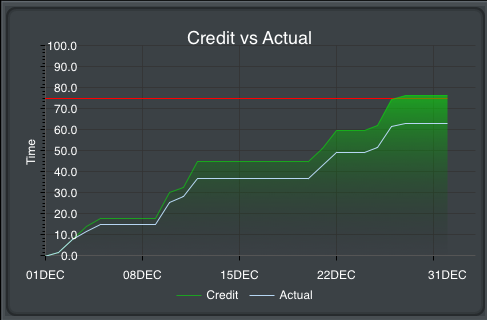
Guarantee is indicated by a horizontal red line for reference. Credit is displayed as a shaded green area while block is displayed as a blue line. Credit values are determined by using actual credit for days in the past while days in the future are projected using actual and scheduled credit. Block values are determined using actual block values only. The graph is automatically scaled in both height and width to fit your data in the selected date range.
Chart
After the graph you will find specific payroll information broken down into various items. On iPhone this chart is below the graph while on iPad it is beside the graph.
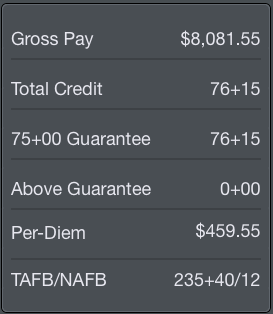
Among these items are:
- Gross pay amount in dollars
- Total credit in hours and minutes
- Hours and minutes toward Guarantee and Above Guarantee
- Per Diem amount in dollars
- Time Away From Base (TAFB) in hours and minutes
- Nights Away From Base (NAFB)
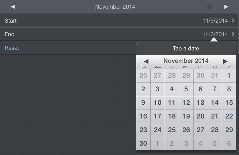
Date Range
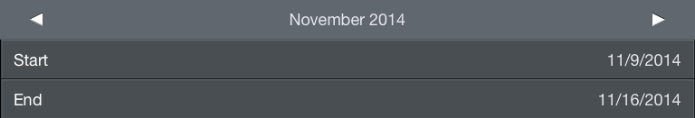
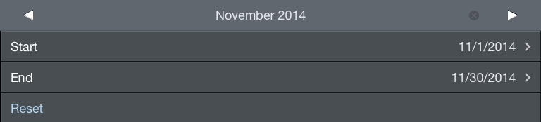
With customizable date ranges, APDL can display multiple date ranges. The graph displays the current month by default when first opened. The month being displayed is shown at the top of the screen along with the beginning and end date. You can display a different month by tapping the arrows to the left and right of the month name. Tap the "Today" button at the top right which shows the current date to instantly view the current month. The date range can be customized if you wish to display any period of time other than a single month. Tap the edit button at the top right to enter edit mode. The edit button looks like a calendar icon. Tapping the start and end date rows will open a calendar and you can manually select dates for your custom range. Your custom date range can be renamed by tapping the month name above the start date. The reset button will set the start and end dates to the first and last day of the month. Tap done to exit edit mode and return to the graph display. A note at the very bottom of the page shows the specific dates, times, and time zone used to determine currently displayed values.![]()
![]()

Pay Details
Below the chart area is a section containing specific pay details. This section is collapsed by default. Tapping the Pay Details row will expand it.
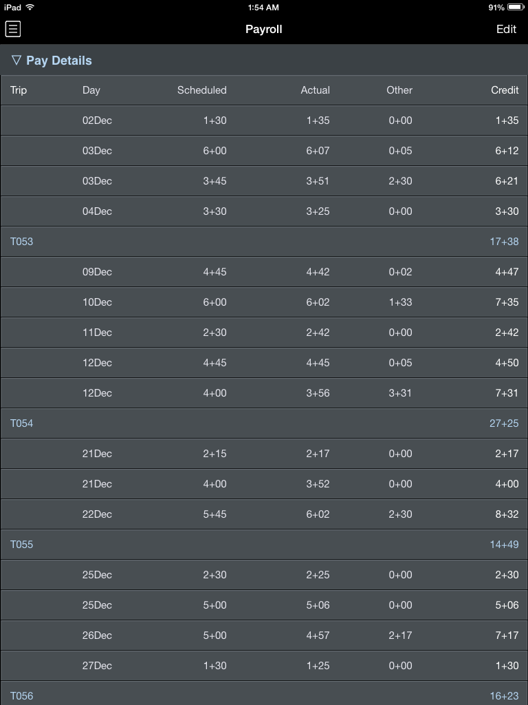
The Pay Details section displays pay information for every day with data entered into APDL. Scheduled block and Actual block are displayed along with an "Other" column where various pay adjustments are contained. The total credit for the day is derived from the greater of scheduled or actual block plus the "Other" value. Days are grouped by trip and displayed in white. The total for the trip as a whole is displayed in blue immediately below the group of days that make up the trip. The last row of the Pay Details section displays your grand total of credit for the entire date range.
Year to Date Summary
The bottom of the Payroll Page displays a Year to Date Summary.
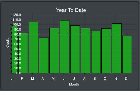
This section is always visible regardless of the Pay Details section above being collapsed or expanded. A bar graph displays your monthly credit throughout the year. The year is based on the current date range and is displayed above the graph in blue. The values displayed are determined using actual credit for past months and projected credit for the current month.
After the graph you will find specific yearly payroll information broken down into various items. On iPhone this chart is below the graph while on iPad it is beside the graph.
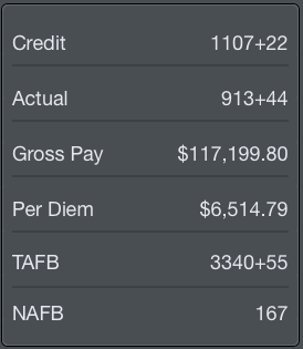
Among these items are:
- Credit in hours and minutes
- Actual Block in hours and minutes
- Gross pay in dollars
- Per Diem in dollars
- Time Away from Base in hours and minutes
- Nights Away from Base